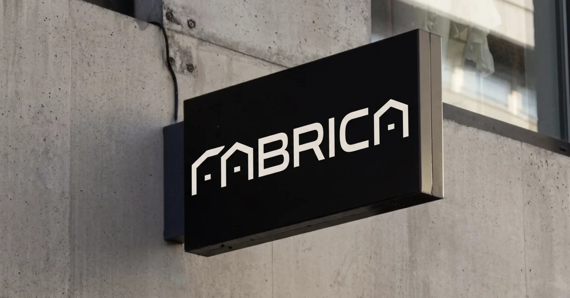
A building full of makers deserves a brand that fits. This week, Blossom delivered the Fabrica brand identity. You will see it on this website from now on, and soon in and around the building too.
A logo with a roof
Take a close look at the wordmark. The F and the A have a sloping top and there is a small square inside the A. To us, it is the roof of a workshop, with light shining through the window. Exactly what Fabrica wants to be: a home for people who make things.
Alongside the wordmark there is a standalone F. It is used where space is tight, from signs in the building to a coffee cup.
Colours from the interior
The colours are taken from the interior of the building. Six shades you will soon see for real:
- Limestone, a light and warm white.
- Concrete, a soft stone grey.
- Walnut, a deep wood brown.
- Burnished brass, a warm brass.
- Olive, a muted green, like the steel window frames.
- Fog, a light grey-green.
They come with textures of stone, wood and metal. Together they give Fabrica a look that takes craftsmanship seriously, without feeling stiff.
From drawing to building
The identity does not stay on paper. It appears on the signage, in the wayfinding to the workshops and studios, on the website and on Instagram, where we show the build. That way, everything to do with Fabrica feels all of a piece, from the first time you open the website to the moment you first walk through the door with your own key.
For you as a tenant, it is about more than looks. A recognisable building is easier for clients and suppliers to find. And a place with its own identity attracts businesses that are just as proud of their craft as you are.
Why it matters
Where you work becomes part of how people see your business. Clients who visit your workshop see the building, the entrance and the shared spaces. A well-kept, recognisable place helps you present your own business well.
Want to see what the building will look like? View the artist’s impressions or get in touch with our team.